

Orange is one of the most vibrant and eye-catching colors in the world. From beautiful sunsets and juicy oranges to autumn leaves and pumpkins, this warm color is everywhere around us. But have you ever wondered what makes the colour orange?
The answer depends on whether you’re talking about paints, light, or how our eyes perceive color. In this article, we’ll explain everything in simple terms so anyone can understand how the color orange is created and why it appears the way it does.
What Makes the Colour Orange?
The simplest answer is:
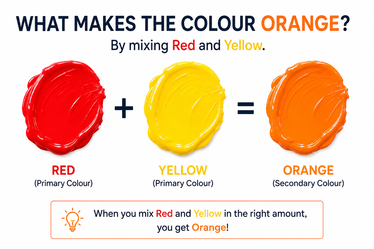
The colour orange is made by combining red and yellow.
This is true when mixing paints, colored pencils, or other pigments. Red provides warmth and intensity, while yellow adds brightness. When mixed together in the right proportions, they create the beautiful orange color.
However, when it comes to light, the process is slightly different. We’ll explain that below.
How Is Orange Made with Paint?
In traditional color theory, orange is a secondary color.
Secondary colors are created by mixing two primary colors.
The three primary colors for paints are:
- Red
- Yellow
- Blue
When you mix:
Red + Yellow = Orange
The exact shade depends on how much of each color you use.
For example:
- More red creates a reddish-orange.
- More yellow creates a yellow-orange.
- Equal amounts produce a standard bright orange.
Artists use this technique to create hundreds of different orange shades.
What Makes the Colour Orange in Light?
Light works differently from paint.
Screens, televisions, and smartphones create colors using the RGB color model:
- Red
- Green
- Blue
Interestingly, orange light is produced mainly by mixing red light with a smaller amount of green light.
There isn’t a separate “yellow light” inside most digital displays. Instead, our eyes perceive orange when the correct balance of red and green wavelengths reaches them.
That’s why orange appears bright and vivid on digital screens.
Why Do Humans See Orange?
Our eyes contain special cells called cones that detect different wavelengths of light.
Orange light has wavelengths between red and yellow on the visible light spectrum.
When these wavelengths enter our eyes, the brain interprets them as orange.
This amazing process allows us to distinguish thousands of shades, including light orange, dark orange, coral, peach, and amber.
Common Things That Are Naturally Orange
Many natural objects display the color orange.
Some common examples include:
- Oranges
- Carrots
- Pumpkins
- Tigers
- Marigold flowers
- Autumn leaves
- Sunset skies
- Fire
These objects appear orange because they reflect orange wavelengths while absorbing most other colors.
Different Shades of Orange
Orange comes in many beautiful variations.
Popular shades include:
Light Orange
A soft, warm color often used in interior design and fashion.
Dark Orange
A richer shade that feels bold and energetic.
Peach
A pale orange mixed with white and a hint of pink.
Coral
A mix of orange, pink, and red that creates a lively appearance.
Amber
A golden-orange shade commonly seen in gemstones and decorative lighting.
Each shade creates a different mood while maintaining the warmth associated with orange.
What Does the Colour Orange Symbolize?
Orange is more than just a color. It carries many meanings across cultures.
It commonly represents:
- Energy
- Enthusiasm
- Creativity
- Happiness
- Warmth
- Adventure
- Confidence
- Positivity
Because of these qualities, orange is widely used in branding, advertising, sports, and marketing.
Many companies choose orange because it attracts attention without being as intense as red.
Why Is Orange Used in Safety Signs?
Orange is highly visible to the human eye.
It stands out against many backgrounds, making it perfect for:
- Construction signs
- Traffic cones
- Safety jackets
- Warning labels
- Emergency equipment
Its brightness helps people notice important information quickly.
How to Make Different Orange Shades
You can create many orange tones by adjusting your color mixture.
Try these combinations:
- Red + Yellow = Standard Orange
- More Red = Red-Orange
- More Yellow = Yellow-Orange
- Orange + White = Light Orange
- Orange + Brown = Burnt Orange
- Orange + Black = Dark Orange
Artists often experiment with these mixtures to achieve realistic paintings and unique designs.
Orange in Art and Design
Orange plays an important role in creative fields.
Designers use orange to:
- Grab attention
- Highlight important information
- Create warmth
- Encourage action
- Make websites feel energetic
Restaurants often use orange because studies suggest warm colors can stimulate appetite and create a welcoming atmosphere.
Interior designers also use orange accents to make rooms feel lively and inviting.
Interesting Facts About Orange
Here are some fun facts about the color orange:
- Orange is named after the fruit rather than the other way around.
- It sits between red and yellow on the visible spectrum.
- It is one of the easiest colors to notice from a distance.
- Orange is commonly associated with autumn and harvest festivals.
- Many sports teams use orange because it symbolizes energy and excitement.
Conclusion
So, what makes the colour orange? In simple terms, orange is created by mixing red and yellow when working with paints and pigments. In digital displays, orange appears through a combination of red and green light, which our eyes interpret as orange.
Whether you admire a glowing sunset, enjoy the color of a pumpkin, or design a vibrant website, understanding how orange is formed helps you appreciate this energetic and cheerful color even more.
Orange continues to be one of the world’s most loved colors because it represents warmth, creativity, confidence, and positivity. Its unique ability to capture attention makes it an important color in art, design, branding, and everyday life.
Frequently Asked Questions
The colour orange is made by combining red and yellow.
No. Orange is a secondary color made by mixing red and yellow in traditional color theory.
No. In paint, red is essential for creating orange.
Digital displays use red, green, and blue light instead of physical pigments. Different screen settings can also affect how orange appears.
Orange pairs beautifully with:
Blue
White
Gray
Black
Navy
Cream
Brown
Green
These combinations are commonly used in fashion, graphic design, and home décor.